

If you're interested in seeing the latest version (after Windows 2022) of Windows Performance Monitor, check out this blog post, "What's New in the Latest Performance Monitor Update."
Performance Monitor has quite a few configuration options. In this blog post, I’ll cover the following:
- View Types
- Configuring the views
View Types
There are three display options – Report, Line, and Histogram.
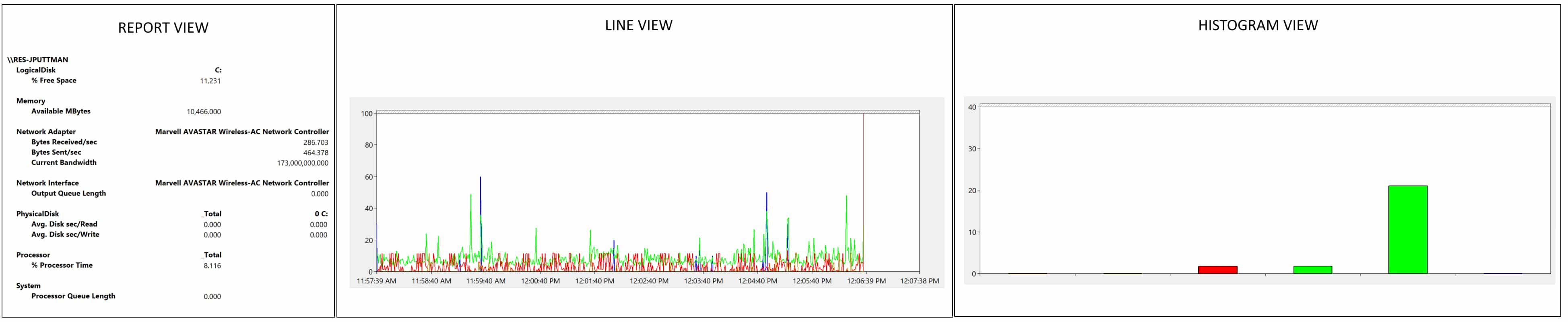
Figure 1 - Three View Types
To switch between the views, select the graph type button drop-down and select the preferred view.
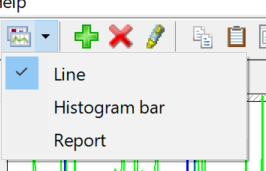
Figure 2 - Switching between views
Report View
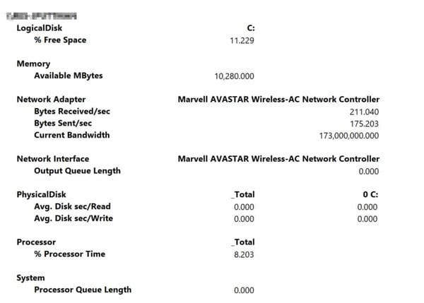
Figure 3 - Report View
The report option is useful because it displays all numerical values for the selected counters. This can be really helpful when you have a lot of counters to understand at once. One nice thing about report view is that you don’t have to worry about adjusting scaling, as you do in line view.
Histogram View
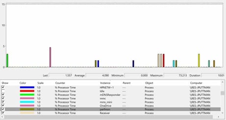
Figure 4 - Histogram View
This view is useful for displaying multiple instances of the same counter to see their relative differences. This performance monitor is set up to show the various processes running on the machine and the percentage of processor time each one is using. The histogram shows how much impact each process has relative to the others.
Line View
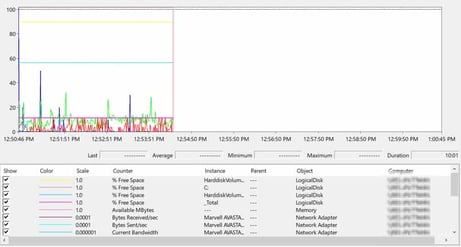
Figure 5 - Line View
The line view is the typical view that you use with the performance monitor. This displays a line on the graph for each counter that you are monitoring. Each counter is auto-scaled when you add it to the monitor, and a color is selected. The line view shows trends over time. It can also be used to visually correlate changes in several counter values. One challenge with the line view is that if you have many counters in the monitor, it can be hard to distinguish between the lines.
Configuring the Views:
To configure the perfmon display, either click the Properties button or right-click on the chart and select Properties.
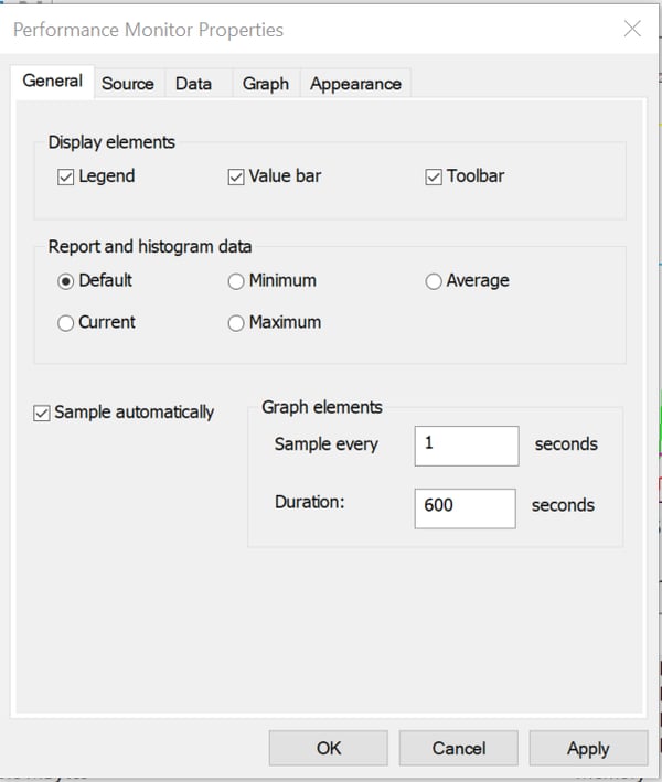
Figure 6 - General Tab
The General tab allows you to set the sampling rate and graph duration.
The sampling rate affects all three views (Histogram, Report and Line). For the histogram and report, the sampling rate affects how often the values in the view are updated. For the line view, the sampling rate affects how often new data is added to the graph.
The graph duration affects the x-axis on the line graph. The default is 100 seconds. When troubleshooting live performance, I typically set this to 600 seconds (10 minutes). This will allow me to make changes and see their effects before and after.
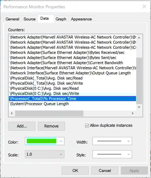
Figure 7 - Data Tab
The data tab allows you to add or remove counters. For each counter, you can choose the color to display in the line graph and the histogram view. The width of the line and the dash style will also adjust the display.
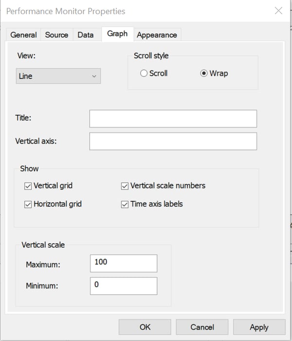
Figure 8 - Graph Tab
The Graph tab allows you to select the view that is displayed and alter the view's general settings. The scroll type “Scroll” adds new data to the far right of the screen and scrolls all the historical data to the left, dropping the oldest data off the edge. The “Wrap” setting will keep a bar moving across the screen at the point of the current data. When the bar makes it to the right side of the display, it will wrap to the left and start the lines at that point.
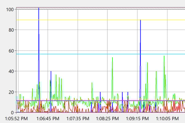
Figure 9 - Graph with Grid Lines
The vertical and horizontal grids add lines to aid in the interpretation of the numbers. The axis labels add or remove the x- and y-axis labels.